Brand loyalty and a successful rewards program are heavily relient on creating a frictionless experience that seamlessly fits into the user's daily life. Thus, initial design efforts focused on creating a simple login sequence with visual cues that are common to frequently used applications and modern design paradigms.
Beyond user onboarding, the designs provide a glimpse of a bold aesthetic that is both simple and immersive. Overall, the design approach is intended to address the need for a far more organized and community-driven experience–one that is reliant upon interactive elements, beautiful photography, and smart conversational content.
View Design Mockups
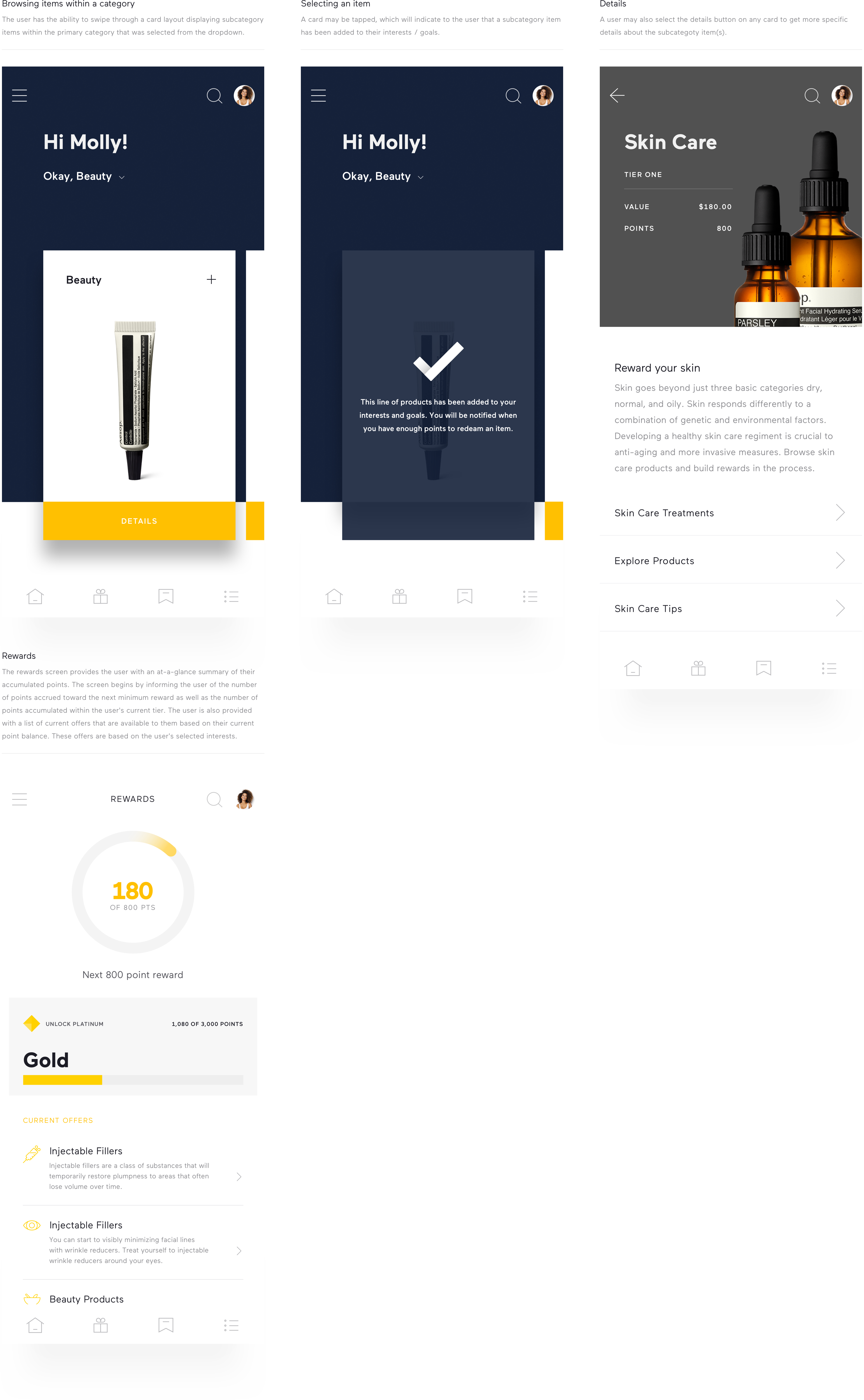
Browsing items within a category; selecting an item, item details, and rewards.
While the yellow certainly creates a bold statement, it presents a significant departure from Allergan's Spotlyte and Regi. By incorporating more earth tones, adding subtle UI elements found within Spotlyte (e.g., the halftone pattern), and pairing the same serif font used by Regi, greater continuity is achieved amongst the brands.