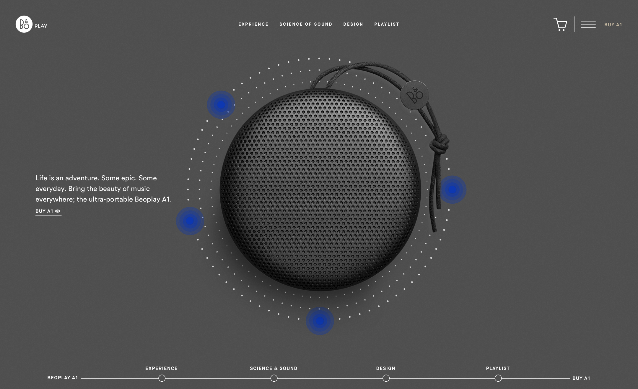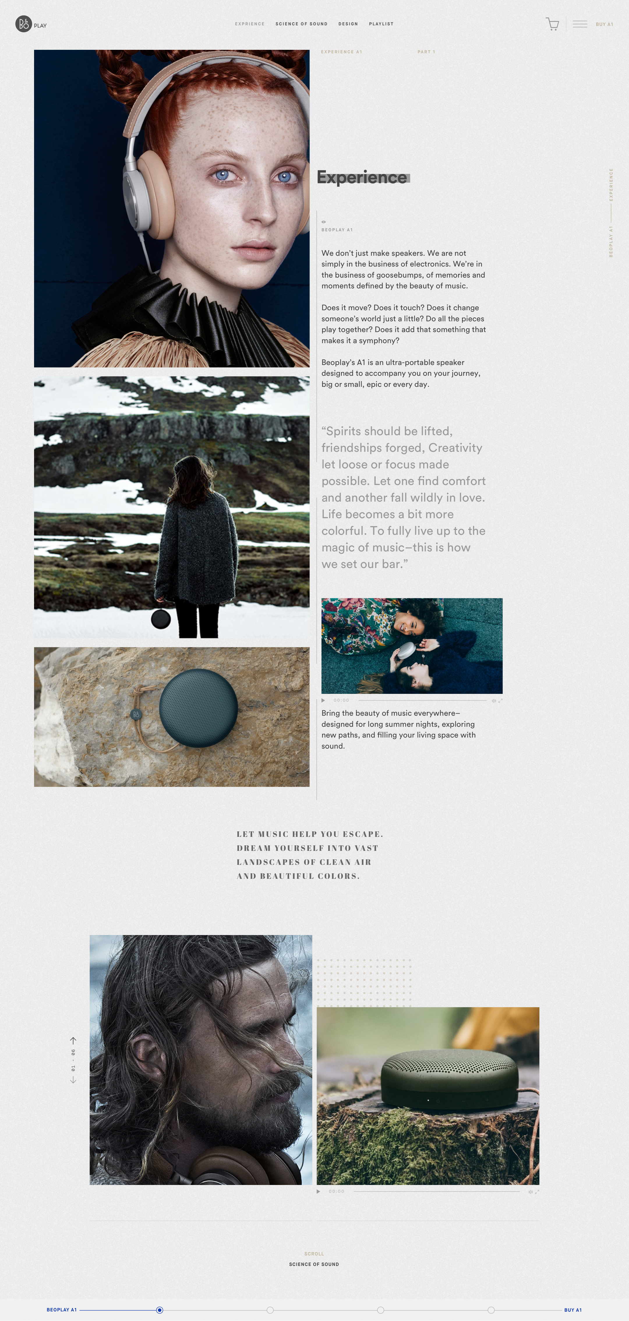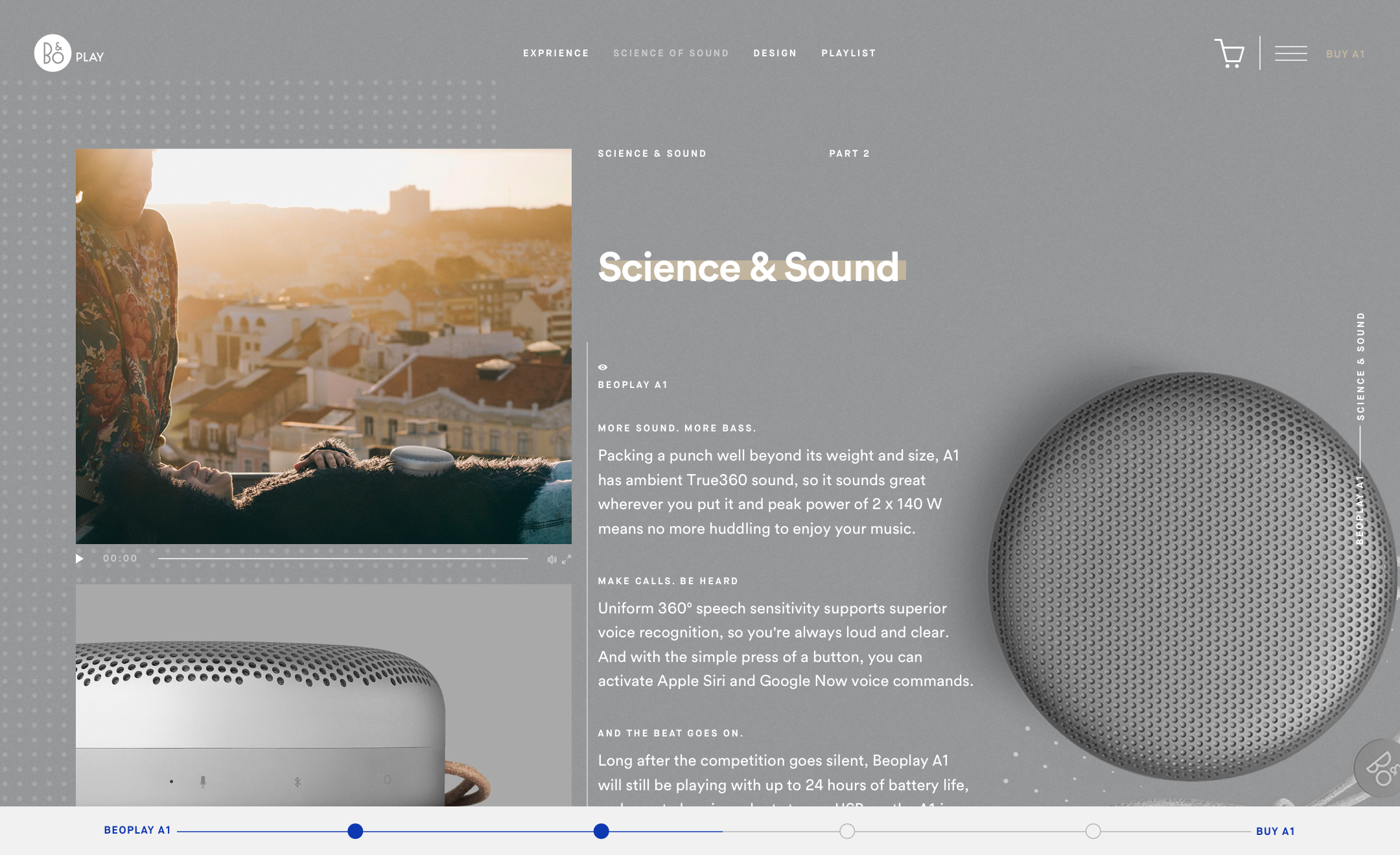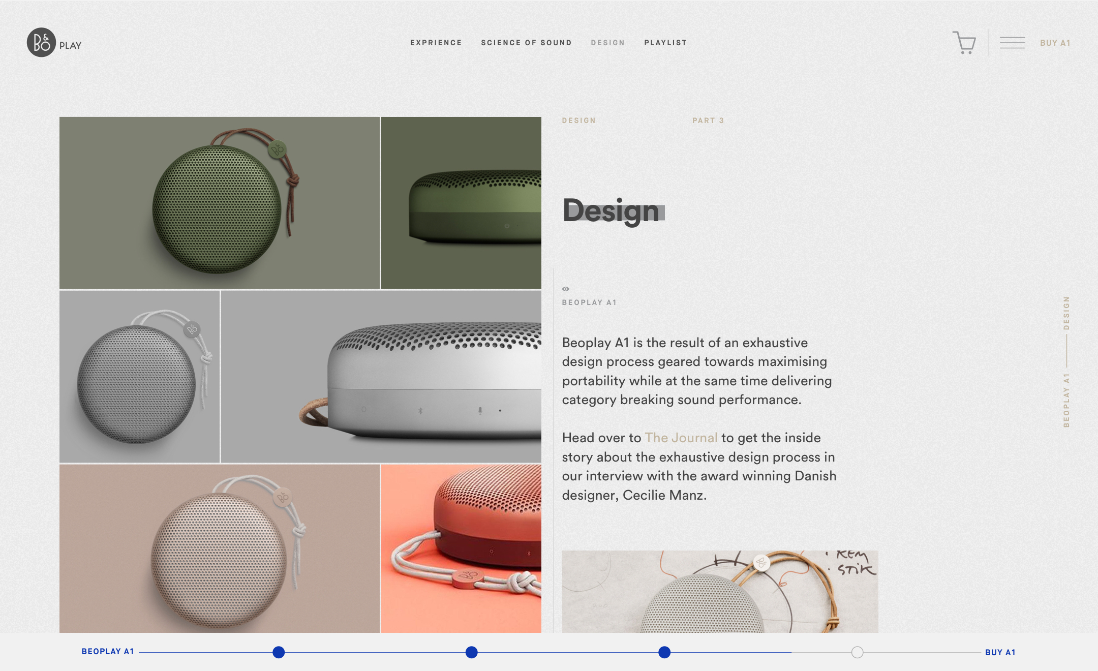
B&O Play invokes a utopian feel building off a visual language that celebrates outstanding craftsmanship, cutting-edge design, excellent performance and a playful approach to modern life that targets young urban professionals that care about the balance between performance and style.
Content is presented within the context of an active lifestyle and often combined with a fashion-forward aesthetic.
UX Thinking
Preliminary research was based on gaining a better understanding of the brand, past campaigns, and the target audience. The goal was to design something unique that did not present a significant departure from brand standards. In analyzing the existing product details page, I looked to create greater consistency from section-to-section, and page-to-page, and offer a more unified and organized experience.
Particularly noteworthy is the lack of a logical progression. While the existing page has specific sections with related product information, the overall experience is frequently overwhelming. Imagery stacked upon imagery combined with text, video, and motion results in a chaotic hierarchy leaving the user to determine what's relevant and what's not. While the goal may be to create an immersive experience, it risks overwhelming the user and is quite taxing on the browser.
UI Thinking
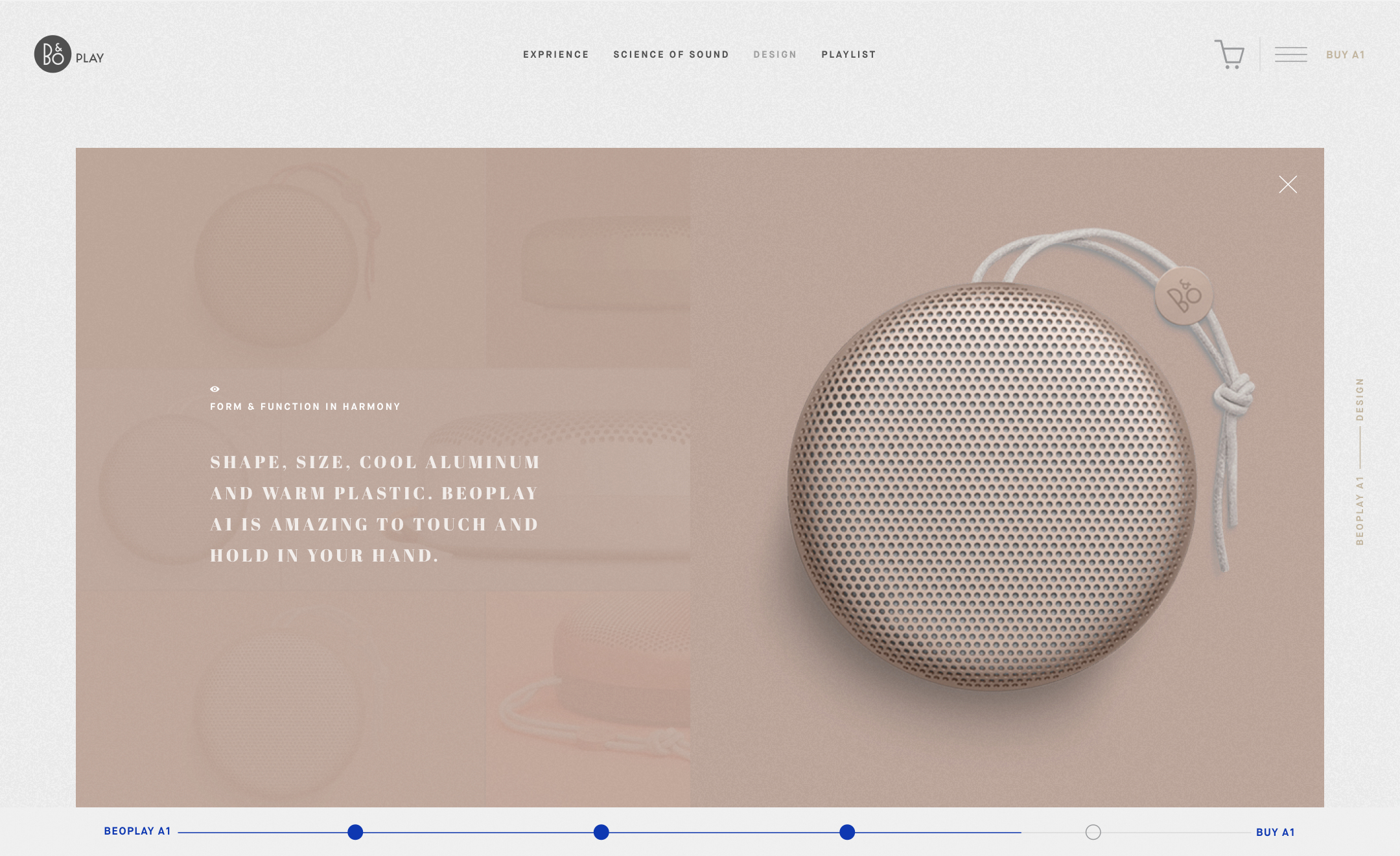
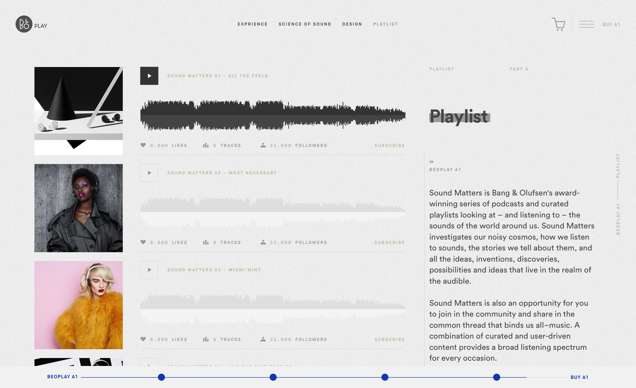
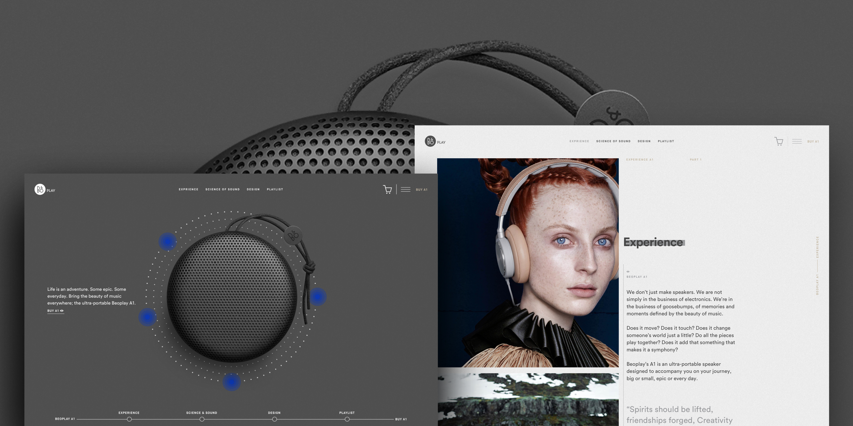
Design efforts focused on creating an immersive content-rich experience combining interactive elements, bold colors, and plenty of white space. Clean lines and white space allows for greater contrast between copy and photography.
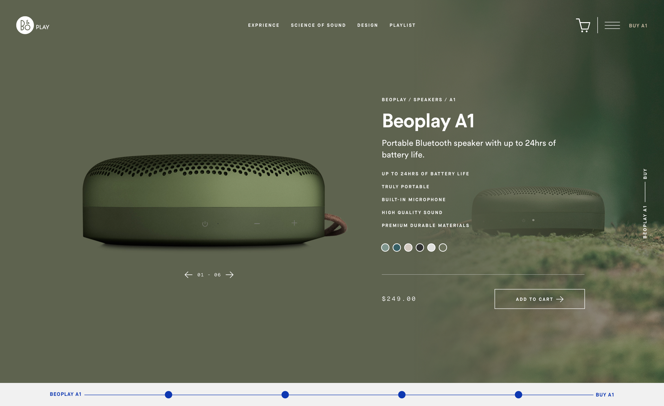
Rather than relying on a single-page layout, the redesign focuses on creating distinct sections. The design provides a more intuitive progression–one that better orients the user, while streamlining how they navigate the site. Users can seamlessly scroll through the site as they would a single-page site, or jump to a specific section; accomplished through the use of traditional navigation links and a visual “timeline” that display’s the user’s progression.
Upon arriving at the site, motion, audio, and interactive elements are combined to quickly grab the user’s attention while keeping the focus squarely on the sleek design of the product. As the user makes their way further into the site, the experience is increasingly defined by a blend of commerce and community. The product and product features remain at the forefront of the design, but the broader experience associated with owning an A1 is highlighted through a mix of video content, photography, and copy that speaks more to the brand manifesto.
Final Thoughts and Approach
Overall, the design approach is intended to address the need for a more organized interface–one that still relies on interactive elements, beautiful photography, and compelling content to create an immersive experience, but presents these elements in a simplified manner that grants the user greater control over their experience. Users can quickly navigate to a specific section, or follow the page from beginning to transaction; both options still providing an intuitive and engaging experience.
